Thursday, 16 April 2015

American Horror Story: Freak Show

Freak Show, is the fourth season of the FX horror television series American Horror Story, set in 1952 Jupiter, Florida. It tells the story of one of the last remaining freak shows in America and their struggle for survival.

American Horror Story: Freak Show

Production Designer, Mark Worthington stated that “this season, we’re turning the freak show inside out. You’ll see it from the point of view of the people in it and see them as people, not objects of derision.”

Before the show aired, promotional posters were revealed to audiences and these allowed viewers to get an insight into the weird and wonderful world of the Freak Show. The shows promotional posters were the starting point at showcasing to the audience the strange and curious world of the Freak Show. These promotional posters are very compelling and mysterious, capturing certain aspects of the freak show and revealing very distinct and original characters. However, these visual images still leave room for imagination and curiosity behind the show, and don’t reveal too much information.


The shows production design lives up to the expectations met by these posters, as they continue to capture an eerie and almost sinister essence. What is more, the sets seen throughout the show have a tendency to reflect this sinister yet appealing quality, that is also reflective through the shows characters. Most of the sets seen try and showcase the glitz, glamour, fascination and talent of the freak show and its performers, rather than the fear and discrimination towards them.


The whole show has a running theme, whether it be the sets, costumes, props, music, cinematography or the characters back story, the whole show embodies a twisted yet engaging artistic appeal that leaves you on the edge of your seat and wanting more. The visual aesthetic of the show flows throughout the whole American Horror Story anthology and the use of cinematography and design is pleasing to the eye.


American Horror Story: Freak Show Promotional Poster


Sources:

http://www.buzzfeed.com/jarettwieselman/behind-the-curtain-of-american-horror-story-freak-show#.yrzrpJjPz
http://www.imdb.com/title/tt1844624/
http://www.telegraph.co.uk/culture/tvandradio/11115772/American-Horror-Story-Freak-Show-meet-the-characters.html

Sunday, 12 April 2015

Oz: The Great and Powerful Influences

Oz: the Great and Powerful is a prequel to the 1939 film The Wizard of Oz and is set 20 years before the events of the original. Production Designer Robert Stromberg figured it was only fitting that the 21st century prequel pay homage to the 1939 iconic Wizard of Oz and to the Golden Age of Hollywood Spectacle. Various major influences were highlighted throughout the film.

Glinda’s Kingdom
Stromberg comments that the captivating dreamscape landscapes of Glinda’s kingdom were influenced by a recalled trip to Switzerland. The major influence for these picturesque scenic views was Switzerland in the summertime and the beautiful aesthetic of the Alps. What is more, for Glinda’s castle Stromberg included a subtle finish to her castle. Glinda travels by bubble, therefore they added an opalescent quality to her castle, and being hit by the light will showcase a reflective rainbow pattern. In addition, a lot of design work went in to creating these fantasy views and this was so that the actors could get a sense of the whole scene. Furthermore, the actors could see not only the physical sets, but embody what was going on behind them on the bluescreens.

'Glinda's Kingdom' - Oz: The Great and Powerful (2013)
Switzerland Landscape

The Emerald City
The Emerald City was heavily influenced and pays homage to 1920’s Art Deco architect Hugh Ferriss. Ferriss’ style was an experimentation with light and shadows; he played with cityscapes and the way he stacked buildings reflected, dark against light. Stromberg revealed in an interview that Ferriss’ style and Art Deco on a whole, suited the back story of the Emerald City. He explains “Emerald City was built by Glinda’s father, then hijacked by these evil witches, so there’s a tension to the air. That’s why Emerald city looks like this masculine monolith with hard angles.”

'The Emerald City' - Oz:The Great and Powerful (2013)
'The Science Centre in The Metropolis of Tomorrow' - Hugh Ferriss (1929)

The Yellow- Brick Road
The Hudson River School, a group of painters in the 19th century who travelled across America, where the main influences for most of the landscapes throughout. The landscapes depict somewhere between realism and surrealism, almost embodying the feeling of actually being in a dream. Stromberg comments “We all know the yellow-brick road, I wanted to take some of those icons that we all know and recognise and bring in some influence from traditional painters”

'The Yellow- Brick Road Landscape' -  Oz: The Great and Powerful (2013)

'Mountains of Ecuador' Hudson River School (1855)

Sources:

Thursday, 26 March 2015

Production Designer & Set Decorator Collaborations

Sarah Greenwood & Katie Spencer

Anna Karenina, Sherlock Holmes: A Game of Shadows, Hanna, Sherlock Holmes, Miss Pettigrew Lives for a Day, Atonement, Starter for 10, Pride & Prejudice, The Last King,The Abduction Club, Bron Romantic, This Year's Love, The Governess

Sarah Greenwood & Katie Spencer (Anna Karenina, 2012)
Roger Ford & Kerrie Brown 
The Raven, Me and My Monsters, Don't Be Afraid of the Dark, The Chronicles of Narnia: Prince Caspian, The Chronicles of Narnia: The Lion, the Witch and the Wardrobe, Peter Pan, The Rage in Placid Lake, Swimming Upstream, The Quiet American, On the Beach, Babe: Pig in the City, Doing Time with Patsy Cline, Children of the Revolution, Babe, Sirens
Dante Ferretti & Francesca Lo Schiavo 
Cinderella, Hugo, Shutter Island, Sweeney Todd: The Demon Barber of Fleet Street, The Aviator, Cold Mountain, Gangs of New York, Kundun, Interview with the Vampire: The Vampire Chronicles, Hamlet, The Voice of the Moon, The Sleazy Uncle, The Adventures of Baron Munchausen, The Secret of the Sahara, The Name of the Rose, Good King Dagobert, And the Ship Sail On, Tales of Ordinary Madness
Dante Ferretti & Francesca Lo Schiavo
J.Michael Riva & Lauri Gaffin
Iron Man 2, Iron Man, The Pursuit of Happyness, Zathura: A Space Adventure, Charlie's Angels: Full Throttle, Charlie's Angels, Tuesdays with Morrie, Lethal Weapon 4, Six Days, Seven Nights

Stuart Craig & Stephenie McMillain
Gambit, Harry Potter and the Deathly Hallows: Part 2, Harry Potter and the Deathly Hallows: Part 1, Harry Potter and the Half-Blood Prince, Harry Potter and the Order of the Phoenix, Harry Potter and the Goblet of Fire, Harry Potter and the Prison of Azkaban, Harry Potter and the Chamber of Secrets, Harry Potter and the Philospher's Stone, Notting Hill, The Avengers, In Love and War, The English Patient, Mary Reilly, Shadowlands, The Secret Garden
Stephenie McMillain & Stuart Craig (The Harry Potter Series)
Dennis Gassner & Nancy Haigh
Ask the Dust, Jarhead, The Ladykillers, Big Fish, Road to Perdition, O Brother, Where Art Thou? The Truman Show, Waterworld, The Hudsucker Proxy, Hero, Bugsy, Barton Fink, The Grifters, Miller's Crossing, Field of Dreams, Earth Girls are Easy
Patricia Norris & Leslie Morales
Killing Them Softly, Big Bad Love, Delivering Milo, The Hi-Lo Country, The End of Violence, Lost Highway, Amos & Andrew, Twin Peaks:Fire Walk with Me, Twin Peaks, Tap

Sources

Tuesday, 17 March 2015

Production Design as Sketch

Production Designers are responsible for the visual aesthetic and concept of a film, television or theatre production. For a Production Designer, every production will simply start off as an idea, which will then need to be transformed into either a quick sketch or a highly detailed drawing. This sketch or drawing is the first step in the visual communication between not only the Production Designer, Director and Producer but with the whole creative team and most importantly the audience.

Eve Stewart's concept design for Les Miserables - Factory Scene

Various styles of expressing concept ideas will vary with Production Designer, some may create quick, fluid pencil sketches, and others will produce a neater, technical drawing. Furthermore, depending on the Production Designer, some feel the importance of producing scale card models alongside their conceptual drawings.

Eve Stewart's concept design for Upstairs and Downstairs
Notable production designer, Eve Stewart,who has worked on the likes of The Kings Speech, Vera Drake and Les Misérables comments how drawing is a very important tool for presenting your ideas to directors and producers, who usually prefer detailed visual communication rather than technical plans.  In an interview she comments

“Not many designers draw anymore and I think it’s really, really important because you can talk about a certain chair until the cows come home but unless you can draw it and draw it quickly you’re not going to get your own way.”

Here she stresses the fact that drawing or even sketching can be a vital skill to possess for a production designer, or any designer for that matter. What is more, being able to express your ideas in an effective and efficient matter can sometimes be a make or break situation for the design. Stewart creates her designs/sketches to be highly detailed, coloured and textured, allowing for her full conceptual design to flow through her drawings, which also makes it easier for the director and producer to visualise.

Eve Stewart's concept design for Les Miserables - Elephant

Sources


Friday, 6 March 2015

Shop Window Dressing


The first point of contact to any shop is its windows. Window displays are the first impression and interaction that the customers experience about the store, no matter how large or small the window, the display is what reveals the essence and identity of the business.
Tommy Hilfiger 'Tailored' Italy (2013)
A common key selling point that mostly all window display possess is a theme. Whether is by a specific time of year, upcoming holiday/event or a bang on trend fashion style, the window display will embody this theme and it is a gateway to the theme running throughout the shop. In addition, the most important element is the famous saying, 'less is more', this is a major aspect to all window displays. For example is there is a overly cluttered display, with too much going on, the display will be visually unflattering. The display needs to be simple and effective, a display that stands out and catches the customers eye.

Harvey Nichols (2013)
Being creative is another major element. Some of the most successful window displays have been imaginative and surreal works of art, that draws the customer in and creates a topic of discussion. What is more, elaborate window displays highlights the care and consideration the business has gone to advertise their products. Furthermore, the products have been intentionally placed to create a viewing focal point.

Harrods 'Ruby Slippers' (2009)

Colour is also a very powerful implement when it comes to dressing window displays. Colours can be associated with occasions, gender, age and emotions, and this can have a huge impact in customer attention. What is more, it is important to get the right colour combination that suits and compliments the theme and products.

Louis Vuitton 'You're Under Surveillance' (2008)

Overall, window displays are mini exhibitions, showcasing the shops finest products and creating customer attention. Visually shop window displays are the main attraction for passing customers, apart from the shops purpose and products, the exterior of the store may make or break a customers decision to step inside.

Harrods (Dec 2014)

Thursday, 5 March 2015

Authenticity in Historical Film and Television

Authenticity and accuracy within historical film and television, is a key component for the areas of Set, Props and Costume. When working on a historically correct film or television programme it is important to use items that either are or look historically authentic. In addition, when a major historical event is depicted it is vital that all elements staged are accurate and authentic to this particular event. What is more, aspects that are not can throw the story and essence completely off balance

Made in Dagenham (2010)

The Boy in the Striped Pajamas (2008)
Films or television that depicts a historical event with some level of accuracy will always find an audience. Audiences like to learn but don’t want to have to make an effort to learn the history, therefore exciting movies and television programmes that are ‘real’, allow for the audience to not only feel like they’ve learnt something, but will also have a new found appreciation for not only history but historical film and television. What is more, if a film or television programme/series is criticised for its history being inaccurate, it is likely that the audience will feel insulted if the history isn’t real enough. In addition, historical film and TV must be exciting, look visually great and portray a sense of what the time period was actually like.

Girl with the Pearl Earring (2003)
The Borgias (2011-2013)


Sources


Choccywoccydoodah

Choccywoccydoodah is a highly creative, art and design based chocolaterie situated in Brighton. They are not your usual chocolaterie or cake shop, Choccywoccydoodah specialise in lavish and sculptural handmade chocolate cakes, from bespoke wedding cakes to extravagant birthday cakes. The magic and process behind these sculptures is a top secret technique, and the team works to a confidential contract.

Some of Choccywoccy’s craziest creations include,

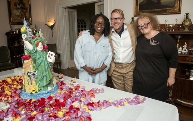
Whoopi Goldberg’s American Spectacular

Hollywood legend Whoopi Goldberg set the team a massive challenge to build a sky scraper of a cake for a fundraising event held in New York. The cake consists of various famous landmarks all sculpted to perfection using chocolate. However, there were difficulties throughout as the team were told they couldn’t bring their own ingredients to American, meaning they had to use the American equivalent to what they needed.

Whoopi Goldberg's American Creation

Greg Rutherford’s Food For Thought

British Olympic long jump gold medallist, Greg Rutherford challenged the creative team to create the biggest candy house to feed 2, 000 people at a charity fundraising sleep out event in London. In the most nerve-racking build, Tom Robertson became chief architect and builder on this creation. The detailed house included a cheeky garden gnome, a welcome home mat, a dog, a pie sitting on the window sill all created out of a mixture of chocolate and sweets. However, this challenge posed a huge construction difficulty as the structure failed to keep its position in transit.
Greg Rutherford's Candy House
The amazing creative team is behind all of these fantastical creations. The main team consists of:

Christine Taylor and Christine Garratt

Creative Director and co-founder of Choccywoccydoodah, Christine Taylor is responsible for choosing, employing and head of the creative team. Former graphic designer Christine is also the driving force behind the chocolate creations with help from her business partner Christine Garratt.

Dave Ratcliffe, Tom Robertson and Jim Thomas

Captain Creative/ Chief designer Dave, his assistant Tom and baker Jim, possess a chocoholic’s dream. Dave, is head of the design work and is the main member of the team to design and create these magical chocolate creations, with a helping hand from the rest of the team. Most of the cakes creates a highly sculptural creations, and the team mould the chocolate as if it were Plasticine and then let it harden so that they can carve it into exceptional forms.


 Sources:


Thursday, 26 February 2015

Judy Farr

Judy Farr is a renowned British set decorator and art director. Farr is well known for her excellent attention to detail and her ultimate dedication to each and every project. She has worked on the liked of The Brothers Grimm, A week with Marilyn, Conan the Barbarian, The Kings Speech and the captivating Downton Abbey.


The British period drama Downton Abbey is one project that Farr ultimately showcases her set decoration skills and her many years of experience. In order to create an authentic portrayal of 1910 England, the creative team analysed old photographs of interiors and involved experts to aid in their research.

Set Decoration - Downton Abbey
With the series being set in Highclere Castle, a beautiful location ion Hampshire, England, it has sparked an interest and curiosity into the Edwardian style and appreciation for British historic homes. Highclere Castle was chosen as the setting for Downton Abbey, because of its individuality between rooms, with each room being decorated differently. Therefore, the creative team did use quite a bit of Highclere’s original furnishings. What is more, they added furnishings, art, period furniture, picture frames, cutlery, crystal ware and lamps, in order to fully capture the setting. In addition, Farr commented in an interview that the team updated the lighting in order to show the transition from gas to electric fixtures that was taking place at the time.
Set Decoration - Downton Abbey


Sources:


Monday, 23 February 2015

Set Dressing/Decorating

Set dressing/decorating is an important working role within any production. A set dresser/decorator works efficiently and effectively to create a scenic environment and simply dressers or decorators the set. In collaboration with production designers and directors, they dress the set using furnishings, artwork, lighting fixtures, props and many other objects to create a reliable and believable set for film and television productions.

Hairspray, 2007
What is more, historical period dramas are a common area for set dressers to work in. Period dramas that are set in, or reminiscent of an earlier time period, are a creative and imaginative area for set dressers to work within. However, within this creative field comes great responsibility. Especially with historical period dramas, every detail within the entire production has to be suitable and fit for that era, and care and consideration for every inch of the set in key. Films such as Pride and Prejudice, Hairspray, Titanic, Pearl Harbour and many more, are just a few historical period films that set dressers/decorators have artistically decorated/dressed every inch of the set, with historically correct elements.

Titanic, 1997
Pride and Prejudice, 2005

Notable set decorators/dressers include:

Richard Roberts, noted for The Da Vinci Code, Elizabeth: The Golden Age, Game of Thrones, Jack the Giant Slayer and Guardians of the Galaxy.

Francesca Lo Schiavo, known for her work on Shutter Island, Hamlet, The Aviator, Gangs of New York, Sweeney Todd: The Demon Barber of Fleet Street and Hugo.

Gordon Sim, known for his work on Driven, Chicago, Breach, Hairspray, Nine, Pirates of the Caribbean: On Stranger Tides and X-Men: Days of Future Past.

Katie Spencer, famous for her work on Pride and Prejudice, Atonement, Sherlock Holmes, Sherlock Holmes: A Game of Shadows, Hanna and Anna Karenina.

Anna Lynch-Robinson, well known for her work on Les Misérables, Bel Ami, Bridget Jones: The Edge of Reason, Made in Dagenham and In Bruges.

Rosemary Brandenburg, known for her work on Hocus Pocus, The Flintstones, Caspar, Psycho, Planet of the Apes, Public Enemies, Hancock, The Island and Cast Away.

Tatiana Macdonald, noted for her work on Billy Elliot, Tinker Tailor Solider Spy, Vanity Fair, The Invisible Woman and The Imitation Game.

Nancy Haigh, well known for her work on Bugsy, Big Fish, Forrest Gump, Dreamgirls, and Oz the Great and Powerful.

Sandy Reynolds-Wasco, known for her work on Pulp Fiction, Kill Bill, Inglorious Bastards, and Reservoir Dogs.

Debra Schutt, notable for her work on The Dictator, Ghost Town, Revolutionary Road and Noah.

Judy Farr, well known for her work on The Brothers Grimm, A week with Marilyn, Conan the Barbarian and The King’s Speech.

Crispian Sallis, known for his work on Hannibal, Jack the Ripper, The Tudors, Gladiator and Camelot.

Sources:


Thursday, 29 January 2015

McCain's "Chip Perfection"

The advertisement showcases the loving care and attention that goes into making McCain chips, from planting the seed to testing the product for qualities such as desirability, crispy-ness, and fluffy-ness.


McCain Foods launched a creative heart-warming advertisement campaign created by BMB, showcasing loving care and attention that goes into making McCain chips. From planting the seed to testing the product for qualities such as ‘desirability’, ‘crispy-ness’, and ‘fluffy-ness’, McCain emphasises the creation of ‘Chip Perfection’. The business challenge, “Resist the trend towards Own Label chips and make people prepared to pay that little bit more for McCain”.


BMB (Beattie McGuinness Bungay) is an independent advertising agency, based in London, who aims to use creativity to solve business problems. Some of their other clients include, East Coast, Dairylea, First Choice, Hula Hoops, Linkedin, Microsoft, Thomson and many more. 

The two main production companies that worked on this advertisement campaign were Partizan and The Mill.

Partizan is an award-winning production company that works in the areas of advertising, music videos, animation, and films. The company is well-known for its creative excellence and has a worldwide reputation with offices in London, Paris, New York, Los Angeles, Berlin, Shanghai and Mumbai. They have produced many advertisements for many of the world leading brands, including Coca-Cola, Cadbury’s, Vodafone, Nokia, Audi and any more.

The Mill is a passionate production company that collaborates with directors, creative agencies and visual brands to bring creative ideas to life. Their reputation is built on the talented minds that make up the company and they find, train and nurture creative, technical and production teams. The company works internationally with offices in London, New York, Los Angeles and Chicago. The Mill provides a range of visual effects and design projects for advertising and delivers various stages of the production from pre-visualisation to conceptual artwork.


Sources: 


Friday, 16 January 2015

Kaiser Chiefs - Ruby

Kaiser Chiefs, ‘Ruby’ music video, features a narrative story, where a mini city is being built around the band as they perform. The music video begins with the band performing in the middle of a desert and the city starts to take shape with various building stages.  In addition, the music video included a vast amount of post-production in order to produce the miniature city. The tiny city grows through the entire length of the video and completely envelops the band. The creative work was shared with a number of companies, including Mathematic, Stylewar and Stink UK.


Mathematic, a Paris based VFX animation and motion design studio, whom centred on Art Direction, their work extends across commercial advertisements, broadcast design, brand content, print realms and music videos.  For the music video, Mathematic assisted in the animation and integration in various shots of the video, especially in the close up elements which were animate within the scene, in particular the building scene in the first half of the clip.


Stylewar, is a group of Swedish directors that produce technically challenging creations. They strive to produce creative freedom in collaborations with various brands and music artists, while still using their unique signature style, with a high level of detail and volatile use of colour.


Stink TV UK, based in London is a marketing and advertising production company, who set out to introduce a unique creative collective to an international stage. There specialties lie in advertising, film and music videos, and they draw on various influences with a team of multi-cultural directors. They aim to produce work that is progressive and challenging, but also fully showcasing the talent of its directors and clients. 


Sources:

Thursday, 15 January 2015

A Journey into Advertising

BBDO is the worlds most awarded, international advertising agency based in New York. The agency aims to tell stories through advertising, both in bite-size and long form and they intend to move their consumers emotionally and change the way they think, feel or act towards a brand. What is more, they believe that ‘in the absence of great work nothing else matters’. The agency’s clients include FedEx, Visa, P&G, Mercedes- Benz, hp, Johnson & Johnson, Starbucks and many more.

FedEx Kinko’s innovative and quirky advertisement campaign, released in 2005, features oversized bottles of correction fluid, giant highlighters and in one case an enlarged office lamp, scattered around the busy streets of New York. The launch of this ad was to redefine the business-services marketplace, through its acquired and re-branded FedEx Kinko’s Office and Print Centre’s. This ingenious and unique ad campaign was invented by the creative team at BBDO advertising agency.

FedEx Kinko's advertising campaign
Furthermore, advertising agency AMV is a part of the BBDO network, and is the biggest advertising agency in the UK. Being a part of the BBDO network, AMV are in good company and now being recognised as AMV BBDO, the agencies together are identified as the world’s most creative and effective network. AMV BBDO work with over 85 brands and some of these include, BT, Sainsbury’s, Walkers, Mars, Aviva and EDF Energy.

The EDF Energy, ‘Feel Better Energy’ advertising campaign, first aired in April 2012, and was an uplifting campaign for EDF featuring former Human League singer, Phil Oakey’s 1984 hit Together in Electric Dreams. The advertisement features the company’s mascot ‘Zingy’, using various indoor and outdoor electric appliances and the ad aims to make customers feel better about the company’s energy services.

EDF Energy, 'Feel Better Energy' advertisement.


 Sources: